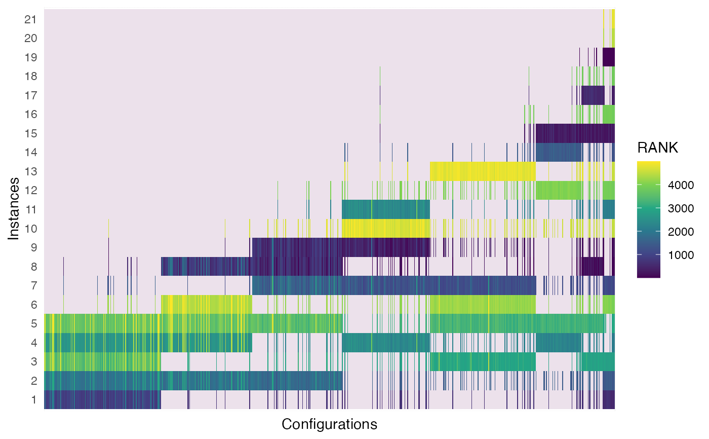
The `plot_experiments_matrix` function creates a plot that shows all experimental data configurations in a heat map fashion. Configurations are shown in the x axis in the order in which are created in the configuration process. Instances are shown in the y axis in the order in which where executed in the configuration process. The colors show the overall rank (across the all performance data) of the performance evaluation displayed.
This plot gives a general idea of the configuration process progression, the number of evaluations of each configuration show how long they survived in the iterated racing procedure.
plot_experiments_matrix(
  irace_results,
  file_name = NULL,
  .interactive = interactive()
)
Arguments
| irace_results | The data generated when loading the |
|---|---|
| file_name | string, File name to save plot (example: "~/patch/example/file_name.png") |
| .interactive | Logical (Default interactive()), TRUE if the plot is generated interactively (plotly package), or FALSE it should be generated statically. |
Value
heatmap plot
Examples
plot_experiments_matrix(iraceResults)